
Better Markdown Rendering in SwiftUI
You can find the MarkdownUI repository here: gonzalezreal/swift-markdown-ui
Markdown has been around for a while and is everywhere, from GitHub README files and comments to inline documentation systems like DocC or static site generators like Jekyll.
SwiftUI is no exception and, since its 3rd iteration, comes with built-in support to display Markdown using a Text view.
struct ContentView: View {
  var body: some View {
    Text("""
      **Thank you!**
      Please visit our [website](https://example.com)
      """
    )
  }
}

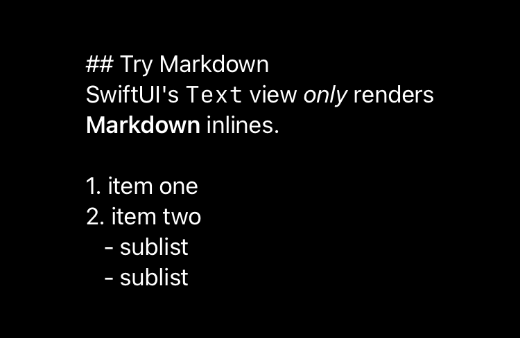
But this built-in support is limited to inlines (links and text styles like emphasis, strong, or strikethrough), ignoring images and block-level elements.
struct ContentView: View {
  var body: some View {
    Text("""
      ## Try Markdown
      SwiftUI's `Text` view *only* renders
      **Markdown** inlines.

      1. item one
      2. item two
         - sublist
         - sublist
      """
    )
  }
}
Markdown is much more than links or styled text. It is a sequence of structural elements like paragraphs, blockquotes, lists, code blocks, and images, which are unambiguously specified in the CommonMark Spec. However, the most used specification is GitHub Flavored Markdown, a superset of CommonMark that defines extensions for task lists, tables, auto links, and strikethrough text.
Introducing MarkdownUI
MarkdownUI is a library for displaying and styling Markdown content in SwiftUI. It is compatible with the GitHub Flavored Markdown Spec and can display images, headings, lists (including task lists), blockquotes, code blocks, tables, and thematic breaks, besides styled text and links.
Once installed via the Swift Package Manager, you must import the library and create a Markdown view by passing a Markdown string.
import MarkdownUI
import SwiftUI
struct ContentView: View {
var body: some View {
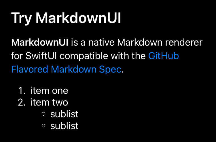
Markdown("""
## Try MarkdownUI
**MarkdownUI** is a native
Markdown renderer for
SwiftUI compatible with
the [GitHub Flavored Markdown
Spec](https://github.github.com/gfm/).
1. item one
2. item two
- sublist
- sublist
"""
)
}
}
But it doesn’t stop there. You can also use an expressive domain-specific language to compose the contents of a Markdown view.
struct ContentView: View {
  var body: some View {
    Markdown {
      Heading(.level2) {
        "Try MarkdownUI"
      }
      Paragraph {
        Strong("MarkdownUI")
        SoftBreak()
        "is a native Markdown renderer for"
        SoftBreak()
        "SwiftUI compatible with the"
        SoftBreak()
        InlineLink(
          "GitHub Flavored Markdown Spec",
          destination: URL(
            string: "https://github.github.com/gfm/"
          )!
        )
        "."
      }
    }
  }
}
The snippet above shows that the content comprises a second-level header and a paragraph. The paragraph, in turn, is composed of strong text, plain text, and a link, separated by soft breaks.
You can even combine Markdown strings with the domain-specific language to create the view content.
struct ContentView: View {
  var body: some View {
    Markdown {
      """
      ## Try MarkdownUI
      **MarkdownUI** is a native
      Markdown renderer for
      SwiftUI compatible with
      the [GitHub Flavored Markdown
      Spec](https://github.github.com/gfm/).
      """
      NumberedList {
        "item one"
        ListItem {
          "item two"
          BulletedList {
            "sublist"
            "sublist"
          }
        }
      }
    }
  }
}
Styling Markdown
One of the aspects in which MarkdownUI shines is the functionality it provides for customizing the content’s appearance.
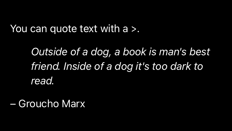
The simplest way to change the style in which the Markdown view displays its content is to apply a different theme using the markdownTheme(_:) modifier. For example, you can apply one of the built-in themes, like gitHub or docC, to a view hierarchy.
struct ContentView: View {
  var body: some View {
    Markdown {
      """
      You can quote text with a `>`.

      > Outside of a dog, a book is
      > man's best friend. Inside of
      > a dog it's too dark to read.

      – Groucho Marx
      """
    }
    .markdownTheme(.gitHub)
  }
}
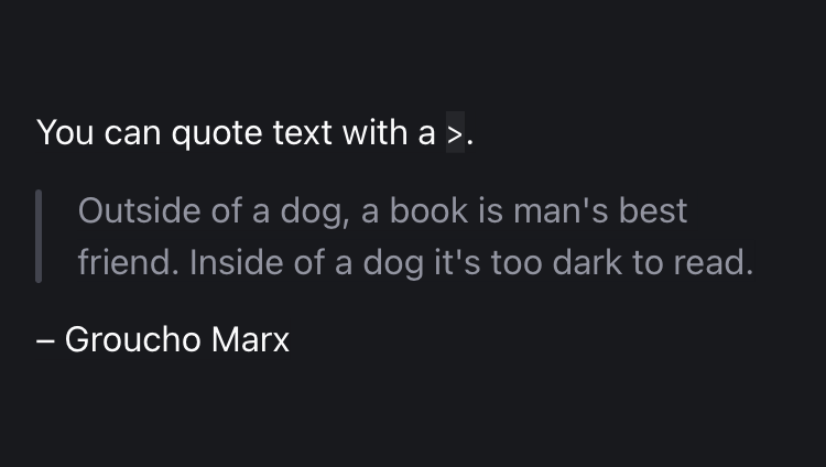
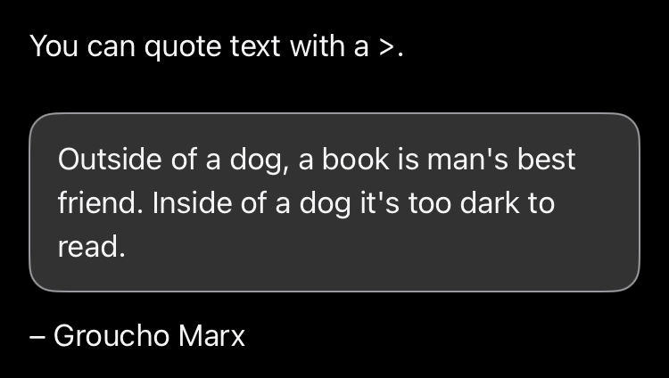
basic (default), gitHub, and docC themes respectively.
A Theme is a unique combination of text and block styles that you can use to customize the appearance of a Markdown view.
Styling text
You can override any text style in the current theme using the markdownTextStyle(_:textStyle:) modifier.
struct ContentView: View {
  var body: some View {
    Markdown {
      """
      Use the `markdownTextStyle(_:textStyle:)` modifier
      to override **any** text style of the current **theme**.
      """
    }
    .markdownTextStyle(\.text) {
      FontSize(24)
    }
    .markdownTextStyle(\.strong) {
      FontCapsVariant(.lowercaseSmallCaps)
      FontWeight(.bold)
    }
    .markdownTextStyle(\.code) {
      FontFamilyVariant(.monospaced)
      FontSize(.em(0.85))
      ForegroundColor(.pink)
      BackgroundColor(Color(.secondarySystemBackground))
    }
  }
}
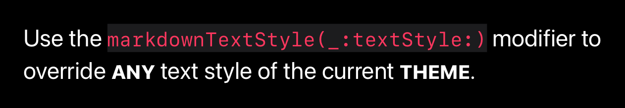
The markdownTextStyle(_:textStyle:) modifier takes two parameters. The first is the Theme key path to the text style to override. The second is a text style builder that combines one or more built-in text styles, like FontSize, FontWeight, or ForegroundColor.
It’s worth noting that CSS properties heavily inspire the built-in text styles, and you can even use font relative units with some of them. For instance, the inline code style in the previous snippet uses em units to express that it wants a font 85% smaller than the current font.
Styling blocks
You can also override any block style in the current theme using the markdownBlockStyle(_:body:) modifier.
A BlockStyle customizes a block by modifying a type-erased view that represents it.
For instance, you can override the current paragraph style to set a different line-spacing and bottom margin. Likewise, you can create a new heading style that uses a different font and a bottom divider.
struct ContentView: View {
  var body: some View {
    Markdown {
      """
      # One heading
      The sky above the port was the color of television,
      tuned to a dead channel.

      It was a bright cold day in April, and the clocks
      were striking thirteen.

      # Another heading
      It was a bright cold day in April, and the clocks
      were striking thirteen.
      """
    }
    .markdownBlockStyle(\.paragraph) { label in
      label
        .relativeLineSpacing(.em(0.25))
        .markdownMargin(top: .zero, bottom: .em(0.8))
    }
    .markdownBlockStyle(\.heading1) { label in
      VStack(alignment: .leading, spacing: 0) {
        label
          .relativePadding(.bottom, length: .em(0.3))
          .markdownMargin(top: .em(1.5), bottom: .em(1))
          .markdownTextStyle {
            FontFamily(.custom("Trebuchet MS"))
            FontWeight(.semibold)
            FontSize(.em(2))
          }
        Divider()
      }
    }
  }
}
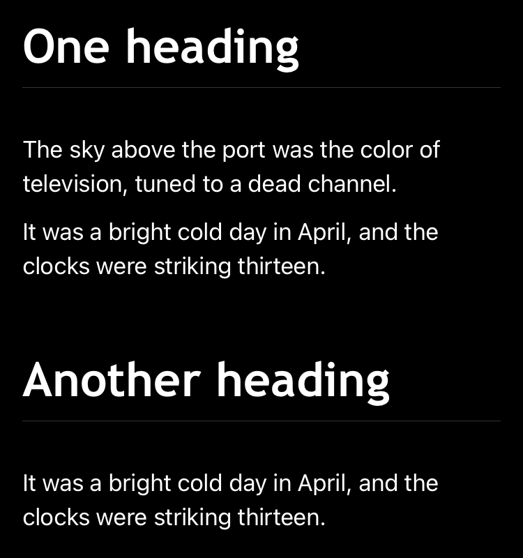
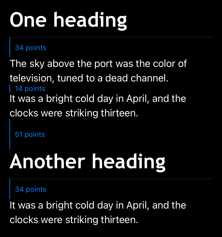
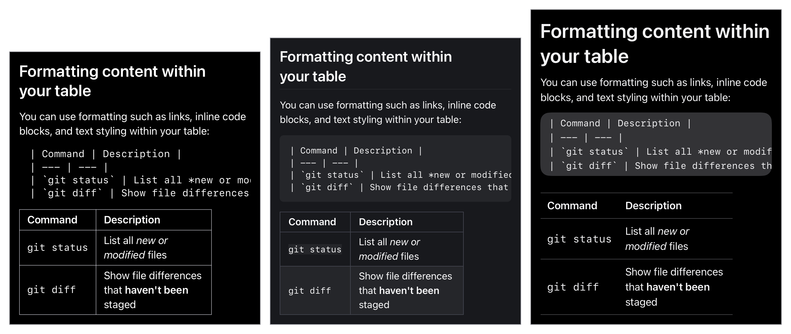
The images above show how MarkdownUI adds spacing between block elements, based on their margin preferences.
Given that the base font size in the basic theme is 17 points on iOS and that the paragraph style sets a bottom margin of 0.8em, MarkdownUI computes the spacing between two paragraphs as 17 * 0.8 = 14.
When computing the space between blocks, MarkdownUI always takes the larger margin. For example, in the snippet above, the heading1 style sets the top margin to 1.5em and the font size to 2em, so MarkdownUI computes the spacing between a paragraph and a heading as 17 * 2 * 1.5 = 51.
It is important to emphasize that the order in which you apply the view modifiers matter. For example, if you apply the text style before the margin preference, MarkdownUI would have computed the spacing as 17 * 1.5 = 25.5.
If you want to change the spacing between list items, you should consider that Markdown supports tight and loose lists.
struct ContentView: View {
  var body: some View {
    Markdown {
      """
      Tight list:

      * item one
      * item two
      * item three

      Loose list:

      * item one

      * item two

      * item three
      """
    }
    .markdownBlockStyle(\.listItem) { label in
      label.markdownMargin(top: .em(0.3))
    }
  }
}
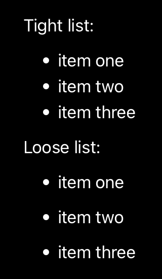
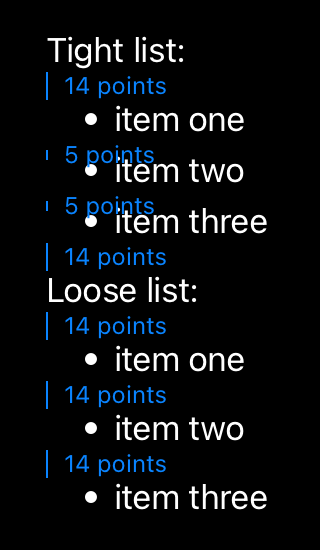
MarkdownUI ignores the bottom margin preference when rendering tight lists. So, you should consider using the top margin preference to make adjustments.
For loose lists, MarkdownUI considers the bottom margin. In the snippet above, as we didn’t define one for the list item, it takes the bottom margin preference of the paragraph style, as list items contain paragraphs.
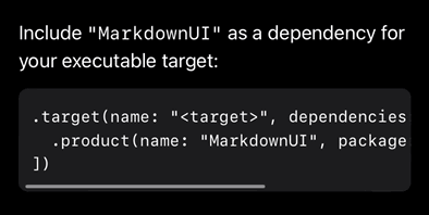
Since a block-style body returns a view, you can do pretty cool stuff, like letting code blocks overflow in a horizontal scroll view.
struct ContentView: View {
  var body: some View {
    Markdown {
      """
      Include `"MarkdownUI"` as a dependency for
      your executable target:

      ```swift
      .target(name: "<target>", dependencies: [
        .product(name: "MarkdownUI", package: "swift-markdown-ui")
      ])
      ```
      """
    }
    .markdownBlockStyle(\.codeBlock) { label in
      ScrollView(.horizontal) {
        label
          .relativeLineSpacing(.em(0.25))
          .markdownTextStyle {
            FontFamilyVariant(.monospaced)
            FontSize(.em(0.85))
          }
          .padding()
      }
      .background(Color(.secondarySystemBackground))
      .clipShape(RoundedRectangle(cornerRadius: 8))
      .markdownMargin(top: .zero, bottom: .em(0.8))
    }
  }
}
Creating a custom theme
If, instead of customizing a couple of styles, you want to create a full-featured theme, start by instantiating an empty Theme and chain together the different text and block styles in a single expression.
extension Theme {
  static let example = Theme()
    .text {
      FontSize(24)
    }
    .strong {
      FontCapsVariant(.lowercaseSmallCaps)
      FontWeight(.bold)
    }
    .code {
      FontFamilyVariant(.monospaced)
      FontSize(.em(0.85))
      ForegroundColor(.pink)
      BackgroundColor(Color(.secondarySystemBackground))
    }
    .paragraph { label in
      label
        .relativeLineSpacing(.em(0.25))
        .markdownMargin(top: .zero, bottom: .em(0.8))
    }
    .heading1 { label in
      VStack(alignment: .leading, spacing: 0) {
        label
          .relativePadding(.bottom, length: .em(0.3))
          .markdownMargin(top: .em(1.5), bottom: .em(1))
          .markdownTextStyle {
            FontFamily(.custom("Trebuchet MS"))
            FontWeight(.semibold)
            FontSize(.em(2))
          }
        Divider()
      }
    }
    // ...
    .listItem { label in
      label.markdownMargin(top: .em(0.3))
    }
    .codeBlock { label in
      ScrollView(.horizontal) {
        label
          .relativeLineSpacing(.em(0.25))
          .markdownTextStyle {
            FontFamilyVariant(.monospaced)
            FontSize(.em(0.85))
          }
          .padding()
      }
      .background(Color(.secondarySystemBackground))
      .clipShape(RoundedRectangle(cornerRadius: 8))
      .markdownMargin(top: .zero, bottom: .em(0.8))
    }
    // ...
}
With that in place, you can use the markdownTheme(_:) modifier to apply the custom theme to a view hierarchy.
struct ContentView: View {
  var body: some View {
    Markdown {
      // ...
    }
    .markdownTheme(.example)
  }
}
Get started with MarkdownUI today!
If you’ve made it this far, I hope I’ve convinced you that MarkdownUI is worth a try.
I’ve barely scratched the surface, and MarkdownUI has a few more tricks. You can explore the companion demo project if you’re interested in learning how to integrate a code syntax highlighter or provide your own (or 3rd party) image-loading library.
Thanks for reading!